Pages

Search This Blog

Tuesday, July 5, 2016

How to Split the Number From the Street Address in Excel


How to Split the Number From the Street Address in Excel

Splitting the number from the street addresses in Excel is something that you do with a feature called flash fill. Split the number from the street addresses in Excel with help from a Microsoft Certified Applications Specialist in this free video clip.

Expert: Jesica Garrou
Filmmaker: Patrick Russell

Series Description: Microsoft Excel is one of the most powerful spreadsheet and document creation tools in existence. Get tips on Microsoft Excel with help from a Microsoft Certified Applications Specialist in this free video series.

Related posts:


Friday, June 10, 2016

Inserting Animated Gif to Excel

Inserting Animated Gif to Excel

Monday, June 6, 2016

Stock Ageing Analysis Reports using Excel

Stock is one of the most important investment made by the entity. Optimum quantity and turnover period is essential for entity to be successful. Faster the conversion, better the prospects for entity as inventories not converting to sales mean stuck-up cash.
This is the third tutorial on aging analysis reports. To read the earlier two tutorials follow these links:
  1. Making Aging Analysis Reports Using Excel – How To
  2. Making Aging Analysis Reports using Excel Pivot Tables – How To
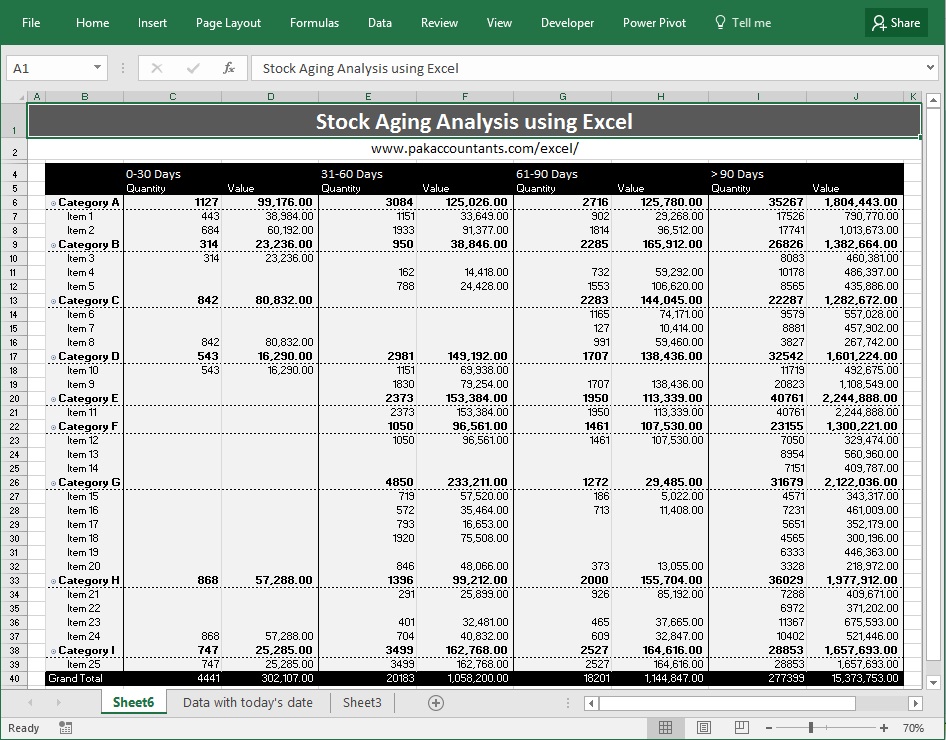
To monitor stock and identify slow moving inventory or that is not converting, stock ageing analysis reports are made. The most common stock ageing analysis involve determining the age of product on the basis of data of purchase and particular date i.e. today’s date or any other date. Following is the stock ageing analysis based on today’s date:
stock ageing analysis excel 1
However, we can prepare ageing reports based on expiry date of stock to identify any expired stock and how many units (with their value) have what time remaining until expiry. Following is the stock ageing analysis based on inventory’s expiry date:
stock ageing analysis excel 2
Lets understand how it is done.

Stock aging analysis using Excel – Step by step

Step 1: Download this tutorial workbook that contains the data that we will use for stock aging reports. It has worksheet with several columns and data range already converted to Excel table.
Step 2: Insert a new worksheet and mention the categories in which you want to produce aging analysis report and the corresponding length of time as shown below and skipping the heading select the range and give it a name using name box. I used ‘srange’
stock aging analysis 1
Step 3: Go to cell I4 and enter the heading “Status”. Click enter and it will automatically insert a new column to existing table.
stock aging analysis 2
Step 4: Put this formula in cell I5 and press Enter key it will automatically populate:
=VLOOKUP(TODAY()-[@Date],srange,2,TRUE)
stock aging analysis 3
Step 5: Select the table by having an active cell within table and hitting CTRL+A combo. Then go to Insert tab > tables group > click pivot table button. A dialogue box will appear click OK. It will insert the pivot table in the new worksheet.
Step 6: Move the fields to quadrants in the following sequence:
  1. To rows quadrant:
    1. Category ID
    2. Item name
  2. To values quadrant:
    1. Quantity
    2. Value
  3. To column quadrant:
    1. Status (above already inserted values field)
stock aging analysis 4
Step 7: Now we need to do few cosmetic changes and its all done:
  • Fixing the “Sum of…” part. Simply remove the part from the formula bar and at the end insert space bar so that Excel don’t thrown an error.
  • Move the column by holding on to the edge of “status” field in the pivot table to appropriate location. In my case “> 90 Days” column was appearing as first which should be last. So I moved it to the end.
  • Change the style to your liking.
  • Turn off header and grand totals if you like.
stock aging analysis 5
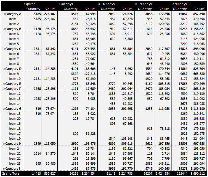
Here is the how it looks in the end with little more styling using borders:
stock aging analysis final
Don’t worry about the font size, just to make it fit here, I have intentionally kept it at 70% so that you can see the whole report. Had it on 100% and everything is normal.

Bonus tip: Dynamic aging slabs

In the above solution we used four slabs of aging i.e:
  1. 0-30
  2. 31-60
  3. 61-90
  4. > 91
What if we want to increase or decrease the slabs? We can definitely change the slabs and change the formula accordingly, however we can make it dynamic to great extent. For this we need to make few changes one time only.
Go to the worksheet where slabs were mentioned and change that data range to table. I named this table “slabs”
Now go to status column and replace the old formula with the following:
=VLOOKUP(TODAY()-[@Date],slabs,2,TRUE)
stock aging analysis 6
Now if you change the slabs, your aging report will update at the push of a button! Remember, currently we have 4 slabs.
Here is if I remove one slab and refresh the pivot table:
stock aging analysis 7
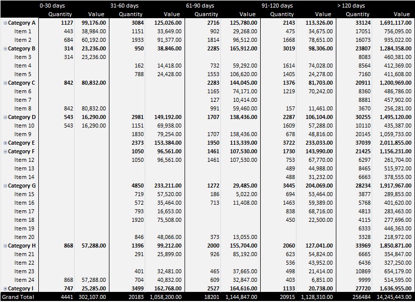
And here is if I add more slabs and then refresh the stock aging report:
stock aging analysis final
So here you have your own stock aging analysis report WITH dynamic slabs! HiFIVE!
Source: http://pakaccountants.com/stock-ageing-analysis-reports-excel-how-to/

Monday, May 9, 2016

Microsoft Excel 2016 Tutorial For Beginners Part 2 Full Intro Learn How to Use Excel 2016


From Subjectmoney

This is a Microsoft Excel 2016 Full Tutorial for beginners & intermediate users.In this crash course Excel video tutorial you will learn how to use Excel 2016 formulas and functions, Excel 2016 new features, Excel 2016 Charts along with many other necessary features that you must know how to use when using Excel 2016.

Excel Charts Tutorial
How to Excel charts
Formatting Excel Chart
Chart Styles in Excel 2016
Microsoft Excel 2016 Tables Tutorial
Excel tables tutorial
how to Excel Tables
Excel Tables for beginners
How to insert pictures in Excel
How to insert word art in Excel
Insert shapes in Excel

http://www.roofstampa.com
http://roofstampa.com
http:/www.subjectmoney.com
http://www.excelfornoobs.com

Microsoft Excel 2016 Tutorial for Beginners Part 1 Full Intro Learn How to Use Excel 2016


From Subjectmoney 

Excel 2016 Tutorial for beginners

This is a Microsoft Excel 2016 Full Tutorial for beginners & intermediate users.In this crash course Excel video tutorial you will learn how to use Excel 2016 formulas and functions, Excel 2016 new features, Excel 2016 Charts along with many other necessary features that you must know how to use when using Excel 2016.

1:38 The Excel Ribbon
2:10 Ribbon Groups and Commands in Excel 2016
2:30 Data Entry in Microsoft Excel
3:08 How to enter data in to a cell in Excel
3:22 How to enter data into the formula bar in Excel
3:50 How to Navigate through Microsoft Excel
4:24 How to navigate and select cells in Excel with keyboard
8:01 Autofill in Excel 2016
9:15 Autocomplete in Excel 2016
10:32 How to zoom in and zoom out Excel 2016
10:50 Formulas & Functions Tutorial in Microsoft Excel 2016
11:25 Addition in Excel
13:04 Autosum Function in Excel
14:03 The Sum Function in Excel 2016
15:45 Subtraction in Microsoft Excel
16:12 Multiplication in Excel 2016
17:15 The Product Funtion/Formula in Microsoft Excel
17:44 How to Find/Search for a function in Excel using the insert function command in the Function Lirbrary
19:29 Division in Microsoft Excel
19:46 the Quotient Function in Excel
21:25 Exponential formulas in Excel
22:20 Concatenation in Excel
23:06 Logical Comparison in Excel
23:08 Equal to logical comparison in Excel
24:17 Logical Comparison Greater Than in Excel
24:36 Less Than Logical Comparison
24:58 Greater than or equal to
25:42 Not Equal to Excel 2016
26:14 Combining Formulas and Functions in Microsoft Excel 2016
29:18 Cell Reference Tutorial in Microsoft Excel
29:57 Types of cell reference in Excel
30:07 Relative Cell Reference in Excel 2016
32:04 Using Autofill for formulas and cell reference
32:25 Show formula in Excel 2016
33:15 Absolute cell reference in Excel 2016
33:10 How to lock cell reference
34:40 Mixed Cell Reference locking only the row or column
39:27 How to refer to cells in another worksheet in Excel
40:06 How to refer to another workbook in Excel
40:35 How to clear/remove/delet content in a cell
40:52 Autofill dates in Excel
41:15 How to delete a row or column in Excel
46:36 How to style and Excel worksheet
46:50 How to format numbers in Excel
47:50 increase of decrease decimals in Excel
48:54 How to format dates in Excel (short date, long date)
40:32 How to resize cells columns and rows in Excel
50:35 the Today function in Excel Today()
51:54 Formattin and styling cells in Excel
52:05 How to add color fill in Excel
52:55 How to add borders in Excel
53:44 How to copy and paste a range of cells in Excel
54:23 Cell Styles in Excel 2016
55:27 Text direction and how to angle diagnal text content and numbers in Excel
57:00 How to Merge cells in Excel
57:53 Merge across in Excel
58:18 Change height or width of cell in Excel
58:49 Font Style in Excel
1:01:37 content alignment in Excel 
1:02:20 Conditional Formatting in Excel 2016

Saturday, May 7, 2016

How to Split One Cell Row into Multiple Rows

Below are some videos on how to one cell row into multiple rows


Thursday, May 5, 2016

What-If Analysis - Data Tables

From excel-easy.com

Instead of creating different scenarios, you can create a data table to quickly try out different values for formulas. You can create a one variable data table or a two variable data table.

Assume you own a book store and have 100 books in storage. You sell a certain % for the highest price of $50 and a certain % for the lower price of $20. If you sell 60% for the highest price, cell D10 below calculates a total profit of 60 * $50 + 40 * $20 = $3800.


One Variable Data Table
To create a one variable data table, execute the following steps.

1. Select cell B12 and type =D10 (refer to the total profit cell).

2. Type the different percentages in column A.

3. Select the range A12:B17.

We are going to calculate the total profit if you sell 60% for the highest price, 70% for the highest price, etc.


4. On the Data tab, click What-If Analysis and select Data Table from the list.

Select Data Table


5. Click in the 'Column input cell' box (the percentages are in a column) and select cell C4.

We select cell C4 because the percentages refer to cell C4 (% sold for the highest price). Together with the formula in cell B12, Excel now knows that it should replace cell C4 with 60% to calculate the total profit, replace cell C4 with 70% to calculate the total profit, etc.

 Column Input Cell


Note: this is a one variable data table so we leave the Row input cell blank.

6. Click OK.

Result.


Conclusion: if you sell 60% for the highest price, you obtain a total profit of $3800, if you sell 70% for the highest price, you obtain a total profit of $4100, etc.

Note: the formula bar indicates that the cells contain an array formula. Therefore, you cannot delete a single result. To delete the results, select the range B13:B17 and press Delete.


Two Variable Data Table
To create a two variable data table, execute the following steps.

1. Select cell A12 and type =D10 (refer to the total profit cell).

2. Type the different unit profits (highest price) in row 12.

3. Type the different percentages in column A.

4. Select the range A12:D17.

We are going to calculate the total profit for the different combinations of 'unit profit (highest price)' and '% sold for the highest price'.

Two Variable Data Table in Excel


5. On the Data tab, click What-If Analysis and select Data Table from the list.

Select Data Table


6. Click in the 'Row input cell' box (the unit profits are in a row) and select cell D7.

7. Click in the 'Column input cell' box (the percentages are in a column) and select cell C4.

We select cell D7 because the unit profits refer to cell D7. We select cell C4 because the percentages refer to cell C4. Together with the formula in cell A12, Excel now knows that it should replace cell D7 with $50 and cell C4 with 60% to calculate the total profit, replace cell D7 with $50 and cell C4 with 70% to calculate the total profit, etc.


8. Click OK.

Result.


Conclusion: if you sell 60% for the highest price, at a unit profit of $50, you obtain a total profit of $3800, if you sell 80% for the highest price, at a unit profit of $60, you obtain a total profit of $5200, etc.

Note: the formula bar indicates that the cells contain an array formula. Therefore, you cannot delete a single result. To delete the results, select the range B13:D17 and press Delete.
What-If Analysis - Goal Seek


What if you want to know how many books you need to sell for the highest price, to obtain a total profit of exactly $4700? You can use Excel's Goal Seek feature to find the answer.

1. On the Data tab, click What-If Analysis, Goal Seek.


The Goal Seek dialog box appears.

2. Select cell D10.

3. Click in the 'To value' box and type 4700.

4. Click in the 'By changing cell' box and select cell C4.

5. Click OK.


Result. You need to sell 90% of the books for the highest price to obtain a total profit of exactly $4700.


What-If Analysis - Scenario Manager

From excel-easy.com

What-If Analysis in Excel allows you to try out different values (scenarios) for formulas. The following example helps you master what-if analysis quickly and easily.

Assume you own a book store and have 100 books in storage. You sell a certain % for the highest price of $50 and a certain % for the lower price of $20.


If you sell 60% for the highest price, cell D10 calculates a total profit of 60 * $50 + 40 * $20 = $3800.

Create Different Scenarios
But what if you sell 70% for the highest price? And what if you sell 80% for the highest price? Or 90%, or even 100%? Each different percentage is a different scenario. You can use the Scenario Manager to create these scenarios.

Note: You can simply type in a different percentage into cell C4 to see the corresponding result of a scenario in cell D10. However, what-if analysis enables you to easily compare the results of different scenarios. Read on.

1. On the Data tab, click What-If Analysis and select Scenario Manager from the list.


​The Scenario Manager dialog box appears.

2. Add a scenario by clicking on Add.


3. Type a name (60% highest), select cell C4 (% sold for the highest price) for the Changing cells and click on OK.


4. Enter the corresponding value 0.6 and click on OK again.


5. Next, add 4 other scenarios (70%, 80%, 90% and 100%).

Finally, your Scenario Manager should be consistent with the picture below:


Note: to see the result of a scenario, select the scenario and click on the Show button. Excel will change the value of cell C4 accordingly for you to see the corresponding result on the sheet.


Scenario Summary
To easily compare the results of these scenarios, execute the following steps.

1. Click the Summary button in the Scenario Manager.

2. Next, select cell D10 (total profit) for the result cell and click on OK.


Result:


Conclusion: if you sell 70% for the highest price, you obtain a total profit of $4100, if you sell 80% for the highest price, you obtain a total profit of $4400, etc. That's how easy what-if analysis in Excel can be.


Saturday, April 9, 2016

Step by Step Instructions for Easy EXCEL Dashboards

Step by Step Instructions for Easy EXCEL Dashboards
By David Wetton

x


Introduction to Pivot Tables, Charts, and Dashboards in Excel

By Jon Acampora of  ExcelCampus.com

Part 1
How to create an interactive dashboard using Pivot Tables and Pivot Charts.
Works with Excel 2003, 2007, 2010, 2013 for Windows & Excel 2011 for Mac

Download file used in the video


Part 2
In this video I explain some of the different pivot table calculation types. Learn how to calculate the average, count, sum, and percentage of total. I explain how to update your pivot table with more data, and also how to refresh your pivot tables.

The video contains a lot of Excel tips, like how to quickly make a duplicate copy of a sheet, how to select the visible cells only, and a lot of useful keyboard shortcuts.

Download file used in the video


Part 3
This is part 3 in the series on Pivot Tables and Dashboards. In this video we bring it all together to create the interactive dashboard.

You will learn how to:
- Group dates into months and years to create a time series trend chart.
- Group amounts to create a distribution (histogram) chart.
- Add slicers to your pivot tables and charts to make them interactive.
- Lots of tips and shortcuts for formatting your charts.

Download file used in the video


Tuesday, April 5, 2016

Built in Functions

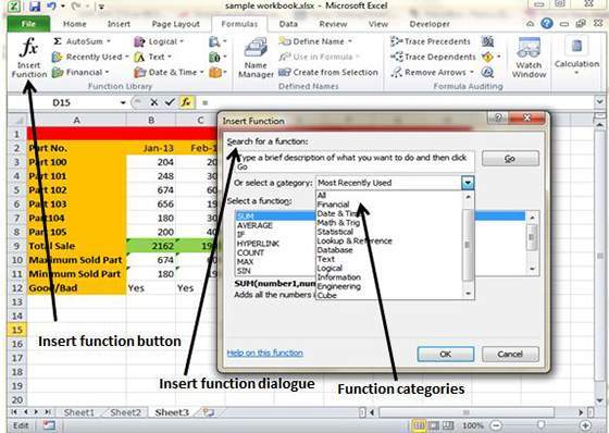
MS Excel has many built in functions which we can use in our formula. To see all the functions by category choose Formulas Tab » Insert Function. Then Insert function Dialog appears from which we can choose function.

Built In Functions


Functions by categories
Let us see some of the built in functions in MS Excel.

Text Functions
  • LOWER : Converts all characters in a supplied text string to lower case
  • UPPER : Converts all characters in a supplied text string to upper case
  • TRIM : Removes duplicate spaces, and spaces at the start and end of a text string
  • CONCATENATE : Joins together two or more text strings
  • LEFT : Returns a specified number of characters from the start of a supplied text string
  • MID : Returns a specified number of characters from the middle of a supplied text string
  • RIGHT : Returns a specified number of characters from the end of a supplied text string
  • LEN : Returns the length of a supplied text string.
  • FIND : Returns the position of a supplied character or text string from within a supplied text string (case-sensitive)

Date & Time
  • DATE : Returns a date, from a user-supplied year, month and day
  • TIME : Returns a time, from a user-supplied hour, minute and second
  • DATEVALUE : Converts a text string showing a date, to an integer that represents the date in Excel's date-time code
  • TIMEVALUE : Converts a text string showing a time, to a decimal that represents the time in Excel
  • NOW : Returns the current date & time
  • TODAY : Returns today's date

Statistical
  • MAX : Returns the largest value from a list of supplied numbers
  • MIN : Returns the smallest value from a list of supplied numbers
  • AVERAGE : Returns the Average of a list of supplied numbers
  • COUNT: Returns the number of numerical values in a supplied set of cells or values
  • COUNTIF : Returns the number of cells (of a supplied range), that satisfy a given criteria
  • SUM : Returns the sum of a supplied list of numbers

Logical
  • AND : Tests a number of user-defined conditions and returns TRUE if ALL of the conditions evaluate to TRUE, or FALSE otherwise
  • OR : Tests a number of user-defined conditions and returns TRUE if ANY of the conditions evaluate to TRUE, or FALSE otherwise
  • NOT : Returns a logical value that is the opposite of a user supplied logical value or expression i.e. returns FALSE is the supplied argument is TRUE and returns TRUE if the supplied argument is FALSE)

Math & Trig
  • ABS : Returns the absolute value (ie. the modulus) of a supplied number
  • SIGN : Returns the sign (+1, -1 or 0) of a supplied number
  • SQRT : Returns the positive square root of a given number
  • MOD : Returns the remainder from a division between two supplied numbers

From tutorialspoint.com

Pivot Charts Excel 2010

Pivot Charts
A pivot chart is a graphical representation of a data summary displayed in a pivot table. A pivot chart is always based on a pivot table. Although Excel lets you create a pivot table and a pivot chart at the same time, you can’t create a pivot chart without a pivot table. All Excel charting features are available in a pivot chart

Pivot charts are available under Insert tab » PivotTable dropdown » PivotChart

Pivot Chart Example
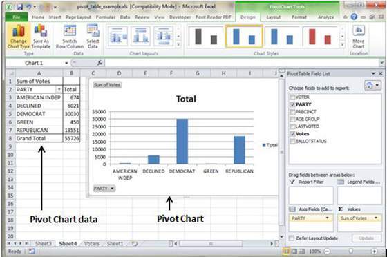
Now let us see Pivot table with the help of example. Suppose you have huge data of voters and you want to see summarized view of the data of voter Information per party in the form of charts then you can use Pivot chart for it. Choose Insert tab » Pivot Chart to insert pivot table.


MS Excel selects the data of the table.You can select the pivot chart location as existing sheet or new sheet. Pivot chart will depends on automatically created pivot table by the MS Excel. You can the the generated pivot chart in the below screen-shot

Pivot Chart Structure

From TutorialsPoint.com...